What are muter colors?
Muted Colors for 2022, also known as desaturated or subdued colors, are colors that are less vibrant and intense than bright or bold colors. These colors are often used in UI (user interface) and UX (user experience) design to create a calm, peaceful, and professional atmosphere.
Muted colors can be created by adding gray, black, or white to a color, which reduces its saturation and intensity. They can also be created by mixing complementary colors, which tend to create a more subdued and harmonious effect.
There are a few reasons why muted colors might be used in UI and UX design:
- To create a cohesive and professional look: Muted colors can help create a cohesive and professional look, especially when used in conjunction with clean and simple layouts.
- To avoid distractions: Muted colors can help reduce distractions and create a sense of calm and focus, which is important for tasks that require concentration.
- To convey a certain mood or atmosphere: Muted colors can be used to convey a certain mood or atmosphere, such as sophistication, elegance, or calm.
- To make content stand out: Muted colors can be used as a background for content, allowing the content to stand out and be more prominent.
Overall, muted colors can be a useful tool in UI and UX design, and can be used to create a cohesive, professional, and calming atmosphere for the user.
Muted color palette inspiration
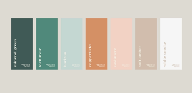
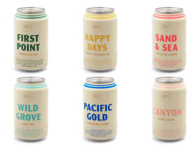
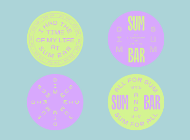
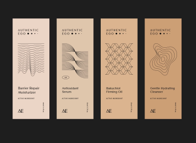

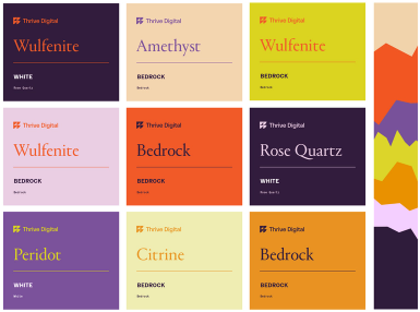

You should see also: UI/UX Design: What is YouTube Ambient Mode
Why Should You Use Muted Colors?
There are several reasons why a designer might choose to use muted colors in their design:
- To create a cohesive and professional look: Muted colors can help create a cohesive and professional look, especially when used in conjunction with clean and simple layouts.
- To avoid distractions: Muted colors can help reduce distractions and create a sense of calm and focus, which is important for tasks that require concentration.
- To convey a certain mood or atmosphere: Muted colors can be used to convey a certain mood or atmosphere, such as sophistication, elegance, or calm.
- To make content stand out: Muted colors can be used as a background for content, allowing the content to stand out and be more prominent.
- To create a sense of balance: Muted colors can help balance out bold or vibrant colors, creating a more harmonious and cohesive look.
The impact of vivid color is greatly diminished if you surround it with other vivid colors. For example, take the red below which is surrounded by a vivid green. The vivid red and vivid green fight each other for attention. You may find this color combination to be jarring and uncomfortable to look at.

If I half the saturation of the green, the color combination is much more pleasing to look at. The green recedes and the red takes center stage.

Overall, muted colors can be a useful tool in design, and can be used to create a cohesive, professional, and calming atmosphere for the viewer or user. It is important to consider the specific goals and needs of the project when deciding whether to use muted colors or more vibrant ones.
