

Get started with the UI Library Design Kit
Microsoft Unveils New Fluent 2 UI Kits for Figma with Variable Support
Microsoft has expanded their lineup of Fluent Design resources for Figma with new iOS and web UI kits focused on enhanced accessibility and customization. Both kits integrate Figma’s powerful variable features, allowing designers to quickly switch between light and dark themes with ease.
Fluent is Microsoft’s evolving design language used across products like Windows, Office and more. The latest iteration – Fluent 2 – places a strong emphasis on inclusivity through carefully selected color palettes and component styles optimized for individuals with visual impairments.
The refreshed iOS and web UI kits help designers bring these important Fluent principles to their own projects. By embracing variables, kits can now dynamically update based on changing contexts while maintaining a consistent brand experience.
What’s New in the Fluent 2 iOS Kit?
The iOS kit contains over 250 meticulously crafted UI elements like buttons, sliders and pickers, all built with native iOS frameworks in mind. Components leverage variables to easily switch between light and dark color modes simply by changing a single variable value.
This provides an ideal starting point for designers prototyping iOS applications that require alternative themes. Variable support allows iteration through various visual treatments without manually rebuilding components each time.
Additional enhancements include enhanced accessibility with proper color contrast ratios across all elements in both light and dark modes. Components also inherit Microsoft’s refined Fluent typography and spacing guidelines to ensure a familiar yet refined look and feel.
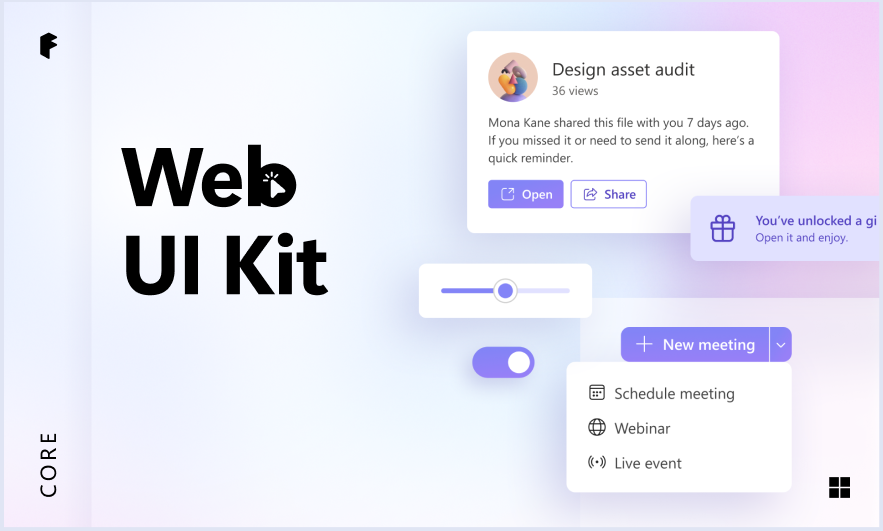
The Web Kit Gets a Variable Makeover
Like the iOS counterpart, Microsoft’s web UI kit gains the powerful flexibility of variables. Designers can now build responsive layouts utilizing pre-styled elements like cards, modals and navigation menus.
A global color variable controls primary and secondary shade values consistently across the entire design surface. Simply adjusting this single variable instantly transforms websites between light and dark presentations optimized for any environment.
Other additions to the web kit incorporate interactive prototyping features. Developers can attach prototype actions to common UI behaviors like dropdowns and sliders. This allows simulating realistic component interactions during review stages.
Accessible Design Made Simple
By empowering designers with variables, Microsoft aims to make implementing accessible Fluent interfaces more approachable. From consistent color treatments to typical component styles, these kits provide an effective starting point for inclusive design.
Designers can focus on crafting intuitive user experiences while letting variables handle low-level style operations behind-the-scenes. This frees up time spent on visual tweaks to instead invest in usability testing and content refinement.
The integration of prototype actions into the web kit further streamlines the design process. Interactions no longer require manual scripting, allowing rapid iteration through early concept phases.
In summary, Microsoft’s renewed Fluent 2 kits equipped with Figma’s variable powers deliver an optimized toolkit for crafting accessible and customizable designs. The ease of dynamically switching themes ensures compliance with Fluent principles remains a frictionless process. This provides an influential standard for inclusive user interface best practices.